Brand Identity Guide
The Silvia Mogas brand
The wordmark, palette, type, photography and visual language behind the brand. Minimal, editorial and global — a system designed to make complex ideas feel tangible.
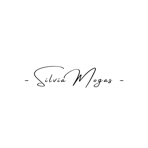
Wordmark
Signature
Colour
Ink
Primary. Text, wordmark, dark sections.
Paper
Canvas. Negative space is part of the brand.
Signal Red
Single accent. Cursor, alerts, key marks.
Muted
Captions, metadata, supporting copy.
Hairline
Borders, dividers, structure.
Dominant paper, confident ink, and Signal Red used sparingly — as a signal, never as decoration.
Typography
Playfair Display
Display & headlines
Making Web3 Tangible
DM Sans
Body & interface
Clear positioning, trusted narratives, real-world adoption.
Signature
Personal mark

Visual language
Line-art globe · city skylines · generous negative space
Photography
Editorial portraits
Confident, high-contrast, on plain or dark backgrounds. Considered, never candid clutter.
Black & white first
Default to monochrome (city and travel imagery). Colour only when the subject demands it.
On stage & in place
Real moments — keynotes, hackathons, cities — that show the builder, not stock gloss.
Applications
Founder · Advisor · Fractional CMO
hello@silviamogas.com

Making Web3 Tangible
silviamogas.com
Misuse
Don't recolour outside the palette
Don't stretch, skew or distort
Don't add shadows, glows or gradients
Don't crowd — always keep clearspace
Don't set the wordmark in another typeface
Don't place on a busy or low-contrast background